


{via}
Today’s post is about decorating with charcoal, really important to know since it’s such a popular neutral right now!
If you have a charcoal sofa (just like during the brown trend, when most neutral-loving shoppers purchased a brown one) it’s time for me to help you bring this colour to life.
Why?
Because a room done entirely in charcoals and greys without a ton of white and light floors to complete the picture is not a happy room at all.
Fallen in love with charcoal? I would rather that you paint your walls charcoal and choose a sofa in your favourite colour, like this indigo blue:
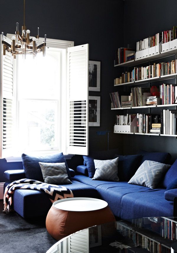 Interior Design by Chelsea Hing
But if you already have one and you’re worried that it’s making your living room feel cold, I’m going to show you right now how to fix it.
By the way, this post was inspired by Susan Hargraves, a talented stylist and True Colour Expert™ in Victoria, BC. I saw an interior she decorated using my favourite colour and thought this would be useful for everyone. Check out her beautiful work below.
I predict yellow will eventually be back in full force, just like it was before the brown trend when I specified it constantly. For many years now, though, I could probably count on one hand how many people ask me for yellow.
But I’m patient, my lovelies! Just wait, it’s coming!
In the meantime, here’s how to decorate around your charcoal sofa:
BALANCE THE ACCENT COLOUR
You need three gradations of an accent colour when you’re decorating. This means a room that looks the most pulled together has small, medium, and large gradations of the colour.
In this room, the small yellow can be found in the paintings, the medium in the throw pillows, and the large in the area rug:

Susan said she had to work with the existing wall colour, which was BM Cabot Trail. It is more brown/red then she would have chosen (you can see how the charcoal sofa is more green) but she did a great job of designing around it. The yellow totally brings this room to life.
 Love this wonderful vignette she created. Interior design by Susan Hargraves
 Interior design by Susan Hargraves
Here’s another view of the colour (above). That’s the biggest challenge for a decorator if you don’t have a completely blank slate is taking existing elements, even if it’s just the wall colour, and still pulling the room together and making it beautiful.
Not everyone can completely switch out their decor when the new trends come along, so read on for some great advice on introducing charcoal to your home:
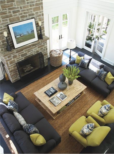
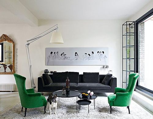
Here in this living room (above), the pillows, artwork, and greens on the coffee table provide the small accent; the chairs provide the medium accent; and the grey-green fireplace provide the large accent:
Also, the sisal area rug reads neutral here, and it is closer to green then a charcoal rug would be, for example. If the room had a charcoal and white area rug, it would look less coordinated and intentional.
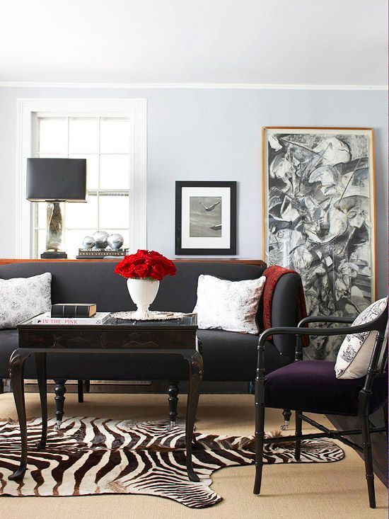
The living room below is a perfect example of what I’m talking about. There’s simply not enough red to make this work:
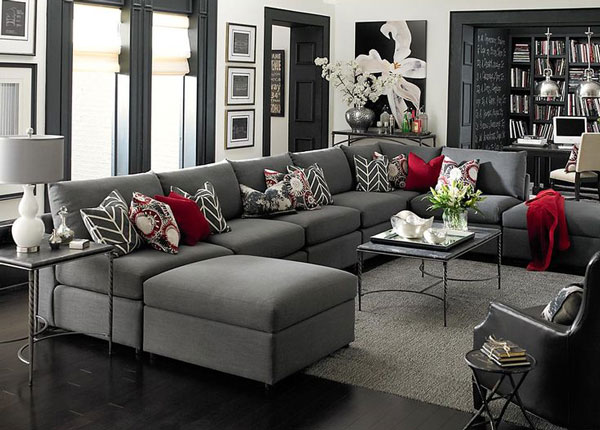
It’s a pretty room, but I would have replaced the red pillows with white ones and layered a black-and-white zebra rug on the floor to repeat the white and keep this palette monochromatic.
COLOUR BLOCK INSTEAD OF INTRODUCING BITTY COLOURS AROUND THE ROOM
Here, we have a charcoal/black sofa with two green chairs. There’s visually almost as much green in this room as charcoal, I did the same thing with the yellow and pink in my living room (below) by just keeping the raspberry in the drapery.
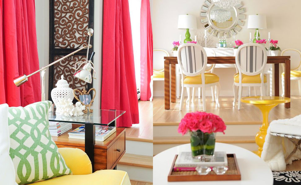
Interior Design by Maria Killam
That’s it.
So, it looks colour blocked instead of bitty and choppy.
There’s a bigger commitment to colour in both rooms. The green chairs in the first image and the raspberry drapes in mine.
If the chairs were white or grey and there were green pillows on the sofa instead (or even if this decorator had also included two green pillows on the sofa to relate to the green chairs), we would have the same effect as the charcoal and red room in the previous photo.
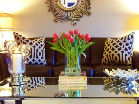
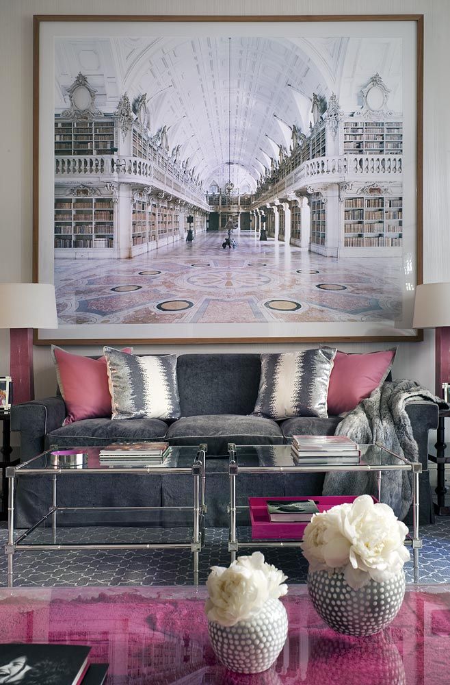
COMBINING BEIGE AND CHARCOAL
A question I get a lot is whether you can combine beige with grey/charcoal. You certainly can, BUT if your entire colour scheme is a combination of varying shades of beiges, golds, and sage greens (in other words, colours that are more dirty, muted, and earthy that have been more popular during the last 20-30 years), that’s when it becomes difficult to introduce charcoal.
If you can eliminate the earthy colours and keep the look more monochromatic like this room, it will work better.
Below is an example of charcoal with pink beige. Not my first choice for a wall colour. This sofa would have looked better with the walls and carpet colour in brown:

Here, the wall colour is very similar, and it works much better with the chocolate brown sofa:
 {via HGTV}
KEEP YOUR WALLS COLOURFUL OR PALE, OR KEEP YOUR FLOORS LIGHT
 Here the walls are colourful instead of grey. {HousetoHome}
 Here the walls are a pale greige. {Cullman Kravis}
 If it’s too late to install light floors, chose a light area rug like this one
{via Better Homes & Gardens}
If you start searching for magazine photos of charcoal or black sofas, you won’t find one inVeranda or House Beautiful (for example) without the contrast of lighter walls, floors or the addition of coloured walls over charcoal paint.
BONUS TIP: YOU ARE NOT THE EXCEPTION
It’s a rare space that works in entirely charcoal on charcoal without a lot of white, perhaps lots of big windows, etc, so just know that if you do choose a charcoal sofa, that is pretty much the end of your charcoal quota.
Most people think that buying a neutral sofa will give them the most flexibility just by changing out pillows. But the problem with that is that the room will still not look finished as I’ve just shown you.
When clients tell me that they get bored easily and like to switch things up, it usually means they have never felt like the room had a look and a feel, so they constantly feel like it needs ‘freshening.’
Now, this is not true for everyone, but in my experience, that is usually what’s missing.
Atmosphere is created with lighting first, then the decorating, and finally with the correct wall colour. You need all three for your room to come alive.
My Chicago course is coming up in a little over three weeks, and there are only 3 spaces left. Two weeks later, in Toronto, there are only 4 spots available. I will be closing Chicago on Friday because we need to work out the remaining logistics and get everything prepared (or sooner if it fills up). You can register here.
Susan Hargraves attended my Specify Colour with Confidence™ Academy two years ago, and this is what she said:
“What Maria Killam doesn’t know about colour, no one needs to know! In fact, after taking her True Colour Expert training a few years ago, following her blog and reading all of her books, I’m not sure there is anything Maria doesn’t know about colour!!!
And here’s the best part: everything she knows, she shares, making you an expert too. Although I have always had a flair and passion for colour, before taking Maria’s training I entered colour consults with a bit of fear and trepidation, not sure if the “magic” would always be there, or if it might lead to some colossal mistakes.
Maria’s systematic approach gave me a “can’t fail” framework that made me a more confident and competent designer. If you’re interested in working with colour, do yourself a huge favour and take Maria’s training.”
LIKE WHAT YOU’VE READ?
Are you renovating or building a house and
need to know where to start?
Do you feel overwhelmed by all the
decisions you need to make?
My 32 Insider Design & Colour Secrets will help you
navigate my blog to get the answers you need.
Get it ABSOLUTELY FREE, along with colourful updates
delivered right to your inbox.
“I feel like I’m learning “secrets” that I didn’t know before
that helps me avoid mistakes I’d make on my own.”
Lee, Colour Me Happy Fan